Introduction
During the summer of 2020, the government of Canada was building its response to the pandemic. Much can be critiqued or praised about their overall response, this case study isn’t about that. One of the strategies involved making use of the Google Apple Exposure Notification Framework to help inform citizens across all provinces of their potential contacts. In this case study, we’ll cover the design processes and custom tools that contributed to the success of the service. I would say that “success” may sound like a controversial word for a service that was always optional, and is no longer in service. The success I want to talk about are more related to the exploit for the Government of Canada to release such a complex service in an un-ordinarily timely manner, and how the team behind was able to continuously support, update and improve the app over the course of its life. A colleague of mine also recently said how this service was a success in how it enabled us, the Canadian digital service, to grow and show the value of government built digital services. Another area of success, on a more personal level, is how we were able to actively focus on accessibility from day 1.
Before I go further, I’d like to shout out a few of my friends that have written about this. Sean Boots outlines a few firsts that happened with this work. Some of my favourite designer friends Kate Wilhem, Élise Cossette and Yedida Zalik go in depth into how they designed content for this service, as well as how they created a phonetic alphabet. Courtney Claessens, Julianna Rowsell, Eman El-Fayomi, and Stephen Yate talk about the first 45 days of our journey.
Reframing tools for designers
Before going into this project, I was involved in a small team trying to put together a proof of concept for a design system for the government of Canada. A design system is many things at once, and we were focusing on using a design system to provide tooling for designers within our small team. When we decided to assemble a huge team to tackle the COVID Alert service, I brought a bit of that momentum along.
When thinking about tooling, it’s easy to think directly to the software that you can use as a designer. And in some way it isn’t wrong, but nowadays design software are all somewhat similar. Figma, Sketch or Indesign will include a range of these generic tools that will help you achieve your ideas. You can design a lot with lines, rectangles, and typography. In fact you can design almost anything. Everything else in a design software will influence, or guide your design process. Figma will give you parametric layout tools not unlike CSS, some starter colour libraries, they will leverage their community libraries to help you get a head start in your designs, and they will promote that way of working.
I’ll get this out of the way, I’m a pretty big Figma fan. I’ve written about the benefits of multiplayer design files. For me, other influential Figma features are the components and libraries. Both these features allow you to work on parametric designs. Parametric design have the benefit of adapting and conforming to different context. This not only limits the amount of time I spend pixel nudging, but it allows more designers to work on consistent designs together.
So when we combine design software with components and libraries, we stop working with the base tools and start working with design decisions. Instead of choosing a colour within millions of choices, we focus on a more limited palette. Instead of drawing rectangles for buttons, we use automatic layouts and spacing to let the button content define its container rectangle. We let our past design decisions inform the future ones. It becomes a neat way of building complex systems that make sense.
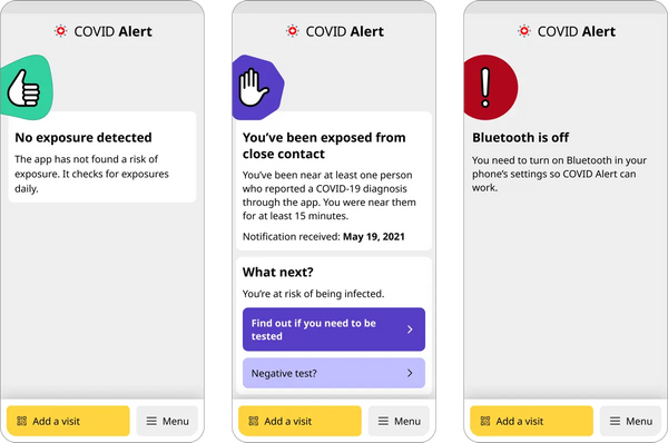
Starting on COVID Alert, I wanted us to work within this kind of environment. COVID Alert doesn’t allow for very complex user interaction. In fact, it was designed as a set once and forget it kind of app. Beyond the initial setup, the app only conveys a status of either unexposed, exposed or unknown. The first one doesn’t lead to further actions, the user might as well close the app. The other two states can lead to further actions. The goal was to make the change in state as evident as possible, which we did by assigning colours and symbols to specific types of content and instructions. This was our primary decision.
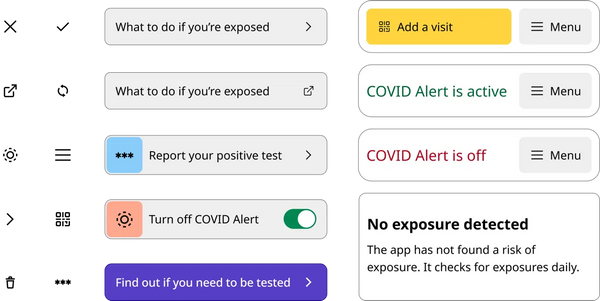
Beyond status, I built a set of atomic component that would be simple to iterate and remix. Icons were custom built on a grid, interactive components were rounded. Typography was consistent and left aligned.
Navigation became a challenge, but we designed a few rules to inform our designs. Coming from a mostly web design background, we quickly found ourselves in design debates about buttons, links, and menu items. We also had to rely on internal navigation within the app, and external links pointing outwards to a web browser. I can’t remember if any of this caused any problems with our users. I don’t think it came up in usability testing or in our support channels, but we had some interesting discussion around it. We never really got around to make reasonable decision on links, buttons, menu items and alike. In the end, my take-away is that decisions like these become tooling for design teams.
Taking a step back, I’m sure we could find a very logical solution to this by removing some of our design requirements, but in the action of rapid prototyping and delivery, making design decisions is hardly possible. I consider design systems to be tools. Even if we didn’t have a complete design system for designing the app, we did have what I would call a proto-design system that was just enough of a tool for us to get by and not lose it over links and buttons.
Continuous design
We were able to deliver the first version of the COVID Alert service within 45 very intense days. Before the first release, we already had plans laid out for the next versions. We had the chance to test the service with users, including app users and health portal users. We were able to include health experts to inform our designs and directions. We brought in accessibility experts to help us find and fix a11y issues. This diversity of input helped us in achieving this deadline, even if it we delayed it slightly.
The hardest part was to facilitate the release of the service across all provinces of Canada. We never really succeeded in doing this. I think most of the challenge came from the usually indifferent relations between federal and provincial levels. In other words, provinces and territories had to opt in the service and become partners to COVID Alert. The government later published some findings about these challenges.
The other part of the challenge, which we were more involved in solving was how this service integrated within all the different provincial health care systems. Some integrated with phone services, some were entirely automated services, some integrated through complex websites. Within the app, this meant that users had different experiences depending on the province they lived in. Fortunately, our design tools helped us adapt, plan and design a custom solution for each province, while providing a similar experience to all users of the service. A lot of our work also centred around welcoming new people from different provinces and territories to the service.
Do accessibility first
From the start, this service was heavily criticized (rightfully) for excluding a lot of people that did not have a smartphone, or maybe shared a smartphone. Elderly people and children being two very vulnerable groups during the pandemic that the app couldn’t reach. We get this uncomfortable portrait where only the most privileged citizens have access to a service that can help them navigate a pandemic. Focusing on accessibility before the first release was both an attempt to minimize the exclusiveness of the service, but also transformed how I now design for accessibility earlier.
Working on accessibility early became a common theme in the user experience design community following 2020. Here is what I learned from working on COVID Alert, and that I’ve applied since then on GC Notify and other services I’ve worked on.
Test with real users
Just like when testing services and products with real users, we opened up our beta tests to everyone. Within beta testers, we had real people that used assistive technology. They helped us find problems with the app early, so that we could fix them for everyone when we released the app.
Get training on a11y
I hinted at a prerequisite to usability testing in the previous section. I think it is more polite to make things as accessible as you can before begining to share your work with real users. Bad user experiences are very frustrating for everyone. An inaccessible bad user experience only multiplies the frustration. We were able to get training as a team to level up our confidence and capacity to create accessible services. There are a lot of companies and resources out there that offer training for things like:
- Scanning and testing
- Coding accessible websites
- Designing for accessible experiences
Get everyone on board the a11y train
I want to dig into the design part. While designing COVID Alert, our dev and design team decided to work closely on features to prototype working experiences fast. This enabled us to test and validate interactions early, and make any adjustments as we designed the full features. This type of close relationship was very successful in a way where we avoided delaying features because of accessibility. Parallel to this, we introduced no accessibility issues after the initial release. I now seen this as a very compelling selling argument when project leaders and directors are challenging working on a11y early.
One example I like to talk about is when designed a date-picking experience. Date-picking is probably one of the most context sensitive experience you can design, and also comes with a variety of known interaction pattern. When asked for a date, it could be a memorable date like your birthday, or it could be a relative date like 3 days ago. Known interaction patterns could be a calendar, but it could also be 3 text boxes for the date, month and year.
With COVID Alert, we were asking our users to enter the date when they first felt symptoms. We asked for this data to better estimate how contagious they might have been on certain dates. Already, we were limiting the possible range of date to the last 14 days. Our first attempt involved using a native calendar picker. We thought this would be the most natural interaction for each user, adapting to their phone operating system (OS).
We quickly sent that idea to the developers to code a prototype, so that we could test the real interaction, with real phones, with real adaptive technologies. It turned out that native date pickers were not providing a good experience in our scenario. Each OS had their own quirks that made calendar pickers a bad experience. We ended this iteration with clear evidence that it wasn’t a good experience, and we moved onto something else quickly.
Our next iterations were a bit more conscious of our specific use case:
- Users should select a date within the last 14 days.
- Users probably vaguely remember the specific date.
- Users probably need some kind of memory boost to remember the date.
Having ruled out date pickers, our remaining interaction patterns were likely limited to:
- Radios
- Input fields
- Select lists
Radio lists of 14 items are most unanimously considered as “too much”. Date inputs for non-memorable dates isn’t helping the user. Turning our attention to the user need, we knew that we were asking relative dates, and that each option was consecutive. Even as a long list of options, each date was pretty readable. Our logical conclusion was to make it into a select list. A user taps on the input box, then scrolls though options to select a date in the past 14 days. This way, we have a compact input field that expands. The list of option is easy to parse, and you can collapse your choice into a compact input box.
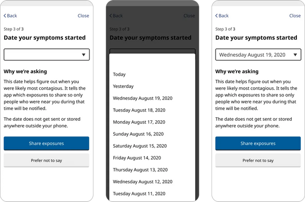
This interaction tested much better with adaptive technology, and with users without adaptive technology. It was not the straightforward solution, but testing early and involving developers allowed us to test and iterate more effectively. Here is how the process can look like. Notice the many feedback loops involving not just designers, but also developers and real users.
- First design iterations
- Dev validation with real prototype
- Test with adaptive tech
- Iterate design based on dev validation
- Test with real users using Figma prototype
- Iterate design based on testing with users
- Dev implementation and QA testing
- Iterate and fix bugs based on QA testing + design reviews of test builds
Annotate your designs
Something that we’ve learned a bit late was design annotations. We always leave notes to our developer friends, but it turns out annotation can be a very powerful tool when combined with some accessibility knowledge. So this is why as a designer, it makes sense to learn WCAG, aria, and all those technical specifications. This is where I think that the designer journey steers away from the visual, toward deliberate multi-sensorial experiences. You begin to also ask yourself: How will this screen sound like to screen-reader users? By taking a step back, labelling, grouping and organizing our designs, we make sure that the information architecture and content strategy is respected through the design to the development stages of a service.
Annotating designs takes the guesswork out of the equation for developers. You can design structured experiences by marking headings, landmarks and regions of your webpages. Labeling your inputs, icons and buttons explicitly ensures that all kinds of users will be able to experience your designs.
Have an a11y tracker
This one is a bit more involved, but very much worth it. In COVID Alert, we first identified all the accessibility issues that we could and made them known publicly. The second part of that work was being continuously better at accessibility by fixing old issues and not introducing new ones. This is where an accessibility tracker becomes useful. You can track them in many ways, but the essential part is that we had metadata associated with each accessibility issue. We knew who it would impact, how many people were likely to experience a bad experience, and roughly how complicated it was to fix the issue. Having a list as a reminder is also a good way to not ignore and forget about the issues that you find. The important thing to remember is to always be a little bit better. Faster than you expect, you’ll find yourself with good momentum and will have a shorter list of issues, but also a more inclusive service.
Concluding my biggest project so far
When reflecting back on my experience contributing to COVID Alert, I am always humbled by how much I do differently today. I’ve always been fascinated by design details, but I never expected to find even more details to care about. Having designs that sound good, that can be navigated with keys and alternative input methods, and visually appealing is perhaps a bit more complex. The other side of this complexity is how each of these facets of user interaction contribute to the overall design quality, clarity, and – as cliché as it sounds – simplicity.