Philippe Caron

Designer & web developer

Directions № 3

April 8, 2024
Philippe Caron

COVID Alert

COVID Alert was an exposure notification app delivered by the Canadian Digital Service for the Government of Canada. Part of this team, I notably created a set of tools and design principles that supported delivery of the app.

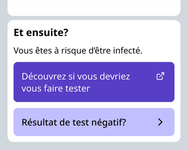
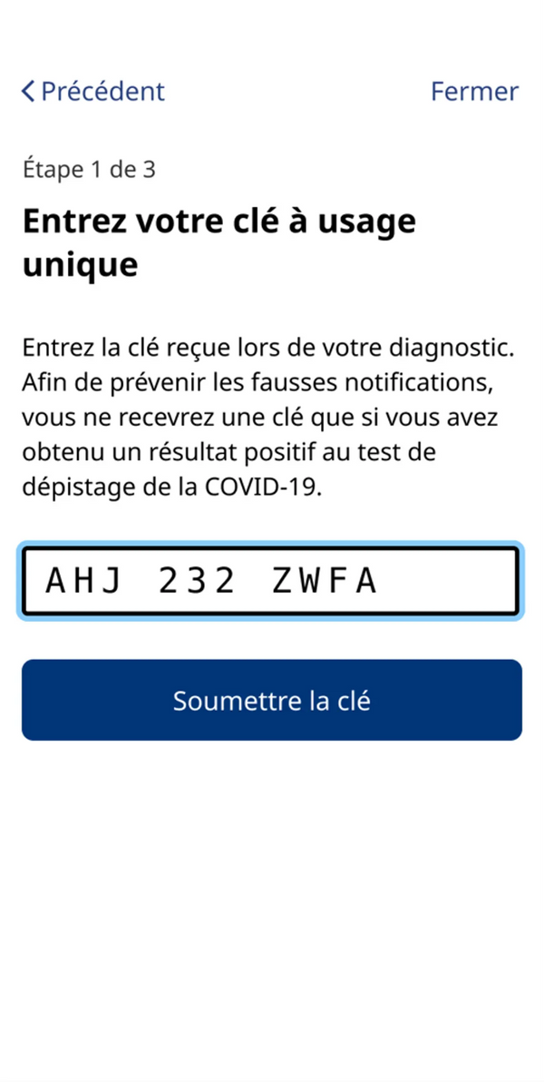
Building an app in 45 days doesn't allow for much iteration and visual maturity. After the launch of the app, and for its entire lifecycle, I continued iterating on design tools. I listened to the developers, designers and policy analysts to figure out their needs and support them. At the same time, I continued to iterate and perfect the app's visual language.

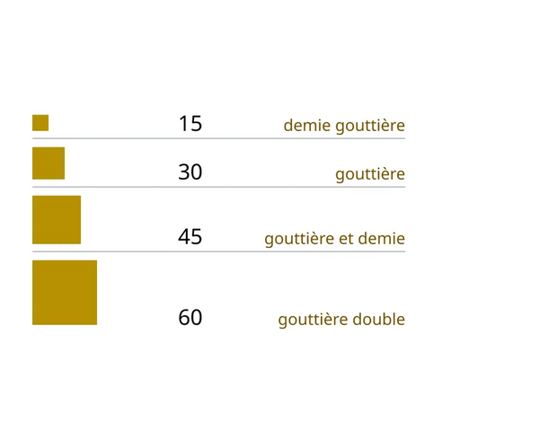
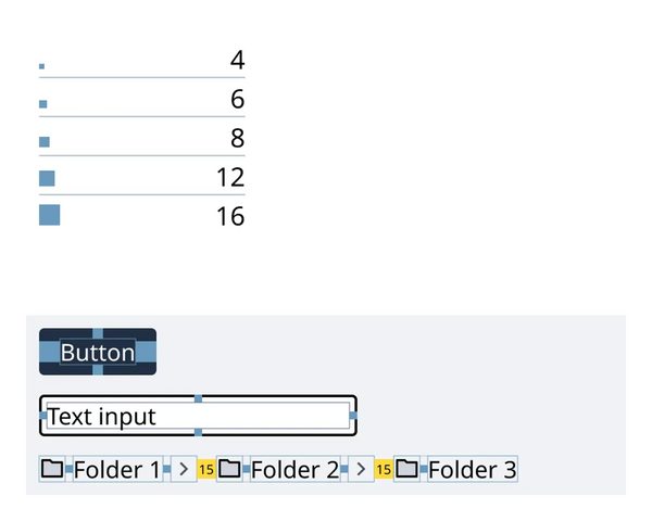
The design tools were mainly centred around Figma. We would document and organise design decisions through clear design artifacts like screen flows. The Figma was organized to cater the needs of the team, and orient the many contributing disciplines. Choosing Figma also strengthened our a11y processes: Interfaces and components were designed to be accessible before handing them off to developers and testers.

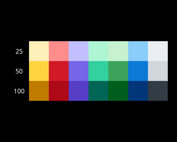
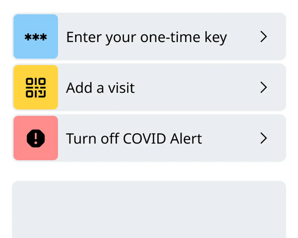
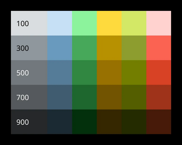
The three toned palette was particularly challenging. My objective was to maximize contrast and simplify colour choices. More about the deign process in the case study.

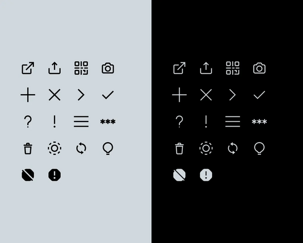
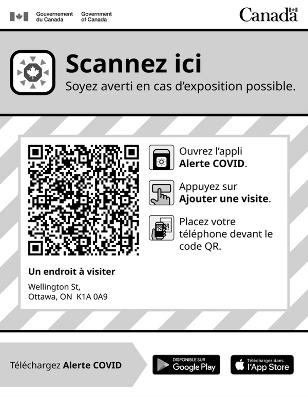
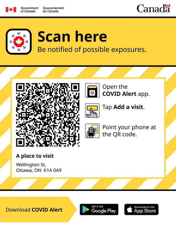
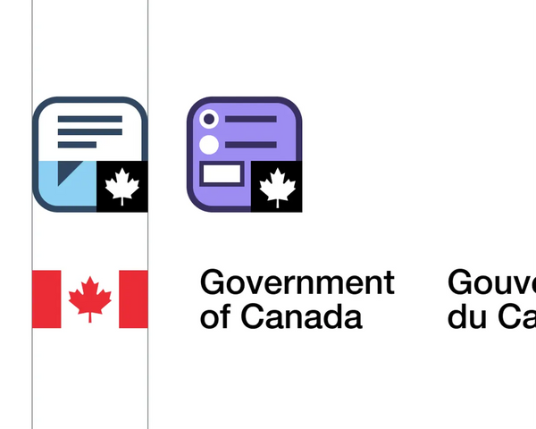
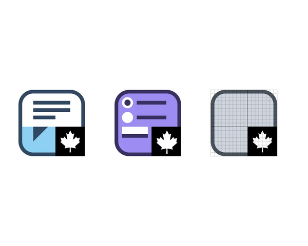
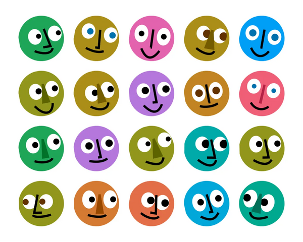
I also drew many icons for the app, including the app icon, hand pictograms and interface icons.

This work was done with the Canadian Digital Service.

Maple leaf in a bright red octagon, circled by small gray triangles pointing inwards, in a white rounded square shape.
COVID Alert app icon
COVID Alert

Design system for a mobile app
Figma Library

A palette of 7 tints of colour. Each tint has 3 shades. One light, one saturated, and one slightly dark.
Color system for COVID Alert
Styled icon of a hand holding a phone in front of a poster to scan a QR code.
Icon for adding a visit
A series of four styled hand icons. Each hand illustrates a different concept for: being okay, gratitude, reminder and being cautious.
COVID Alert hand icons make things feel human.
A set of 18 icons are repeated on a light background, and a dark background. The icons are simple, and have uniform proportions. The icons represent various concepts like arrows, a trash can or a secret key.
Icons for COVID Alert
A box indicates a status of OK. A thumbs-up icon on a green background hints that everything is OK, and the main content confirms that everything is OK
Exposure status, OK variant
Three navigation options. Each option displays a unique icon, colour and label
Navigation group
A box indicates that Bluetooth must be turned on. Some instructions help understand why.
Card component, technical problem variant
A box indicates an exposure risk. Two immediate actions are proposed.
Card component, multiple actions variant
Mobile app interface enabling the user to enter a one-time key. The key is displayed in big characters.
Entering a one-time key
Mobile app interface enabling the user to scan a QR code with the camera.
Adding a visit with a QR code
Gray scale poster with big QR code in the middle. The title Scan here is written in large. Pictograms show how to scan the code with the COVID Alert app.
Visit poster in shades of gray
Colour poster with big QR code in the middle. The title Scan here is written in large. Pictograms show how to scan the code with the COVID Alert app.
Visit poster in colour

Notify

Notify is an app for Canada's public servants. Our small bu mighty team is continuously improving this Web app. Launched in 2020, I joined the team in 2021 and have since delivered big and small changes in almost every nook of this app.

Part of my role includes supporting the delivery of features that have a clear, modern and coherent visual language. Starting with a Figma library, I cloned the components that we had in code. By doing this, I was able to document and identify areas of improvement with colour, typography, components and patterns. This documentation was then looped back into the code, and slowly improved and stabilized the visual language.

Some of my additions include an illustration set that make the interface more welcoming and less serious. The typography selection extends Noto Sans, used on Canadaa.ca, by adding the Display family member for headings.

A simple illustration of a bird inspecting what looks like an email.
Detective pigeon
Notify

Design system for Web application
Figma library, Jinja, HTML, CSS and Javascript

Illustration of a truck carrying what appears to be an Excel spreadsheet.
The truckload
A bird watches as 2 chat bubbles disappear into a hole
The void
A composition to illustrate a font. The font is slightly narrow and a humanist type. It belongs to the Noto Sans family.
Noto Sans Display by Google
A composition to illustrate a font. The font is slightly narrow and a humanist type. It belongs to the Noto Sans family.
Noto Sans Display by Google
A composition to illustrate a font. The font has a normal width and is a humanist type.
Noto Sans by Google
A mix of form components. Buttons, text fields and option fields are distinct, but share the same visual language.
Form components
Widgets
Four boxes show different statistics. 2 show a number in relation to a limit. The other 2 show a limitless number.
A set of components helps browse content. A title, some breadcrumbs and a list of selectable items.
Browse pattern
A box showing a bit of guidance and an action link.
Guidance card
A box contains guidance when there is no data to show. An illustration makes the content more fun.
Empty state
Navigation bar that also shows 3 live statistics.
Navigation pill

Government of Canada Platform design kit

Platform is a set of tools, like Notify, made to enable public servants to deliver modern services. Starting from Notify, the goal was to group design efforts to organize and align ono a visual language for the platform's apps.

Colour tokens are designed to help choose a colour. I did this by finding a balance between contrast and number. There are 5 shades per colour. The shades are designed in the LCH colour space, so colour combinations are predictable across the entire palette.

The kit also contains dimension tokens to be used within atomic components or as layout spacing. I've also created two icon systems to be used to identify different apps within the platform – Notify and Forms now – and others later.

In collaboration with Sam Sadasivan and Carolyn Connors.

A palette of 6 tints of colour. Each tint has 5 shades while maximizing contrast between shades.
Colour system for Platform
Government of Canada Platform design kit

Figma library

Two icons drawn on a grid to make sure they belong together. The width of the icons also work with the proportions of the logo of the government of Canada.
System B
Two icons drawn on a grid to make sure they belong together.
System B. Grid
A table of dimension tokens going from 4, to 6, 8, 12 and then 16. Dimension tokens can be used to create atomic components.
Dimensions for components
A table of 4 dimension tokens going from 15, to 30, 45 and then 60. Dimension tokens can be used to create horizontal and vertical rhythm.
Dimensions for layout and rhythm
Layout grid showing ratios of the logos. Logos either follow a 2 to 1 or a 1 to 1 ratio.
System A. Ratios
Layout grid showing relative proportions of logos to reflect their hierarchy.
System A. Proportions
Layout grid of logos show how ratio and proportions work together to bring harmony to the logo system.
System A. Harmony
Four logos. Logos are aligned to show how similar they are. Each make use of a distinct colour, but share the same boxy visual attributes and font.
System A. Icons

Sans Atout

I created the Sans Atout design system in my spare time. It helped me design a tabletop multiplayer card games. The system extends Chakra UI and the Reasonable Colours system.

The Reasonable colours really helped me create vibrant and lively visual language. In addition, I also selected a large variety of typefaces that somehow work well together.

Tartans and avatars are randomly generated

The main goal of this project was also to draw sets of playing cards. I've started with the four suits, and followed with some card art. In the future, there will be an opportunity to draw figures.

The design system powers the multiplayer game platform 52 Cartes. The beta version contains a game named Huit in French, but could be extended with many more card games and languages.

3 game boxes. Each box is a conceptual composition of coloured playing cards.
Game boxes
Sans Atout

Chakra UI components, NextJS, Boardgame.io, Storyboard

A system of form components. Buttons, text fields and avatars combine to create a series of unique form components.
Form components
A composition to illustrate a font. The font is wide. The apertures are contrasting with the strokes. The characters almost feel square, but are definitely more round overall. The stroke ends are straight.
Clash Display by Indian Type Foundry
A composition to illustrate a font. The font is wide. The apertures are contrasting with the strokes. The characters almost feel square, but are definitely more round overall. The stroke ends are straight.
Clash Display by Indian Type Foundry
A composition to illustrate a font. The font is wide. The apertures are contrasting with the strokes. The characters almost feel square, but are definitely more round overall. The stroke ends are straight.
Clash Display by Indian Type Foundry
Numbers from 2 to 10 and letters J. O. K. E. R. A. and Q. placed on a bright yellow background.
Token Bebop for a numerical suite and other letters
Token Bebop written in big white capital letters on a white background. The font is thick and curvy at the same time. The serifs are also thick like an egyptian, but the overall effect gives western vibes.
Token Bebop par Phantom Foundry
The word Sharpie written three times in tall uppercase. The font is a grotesque script as if written quickly with a marker.
Sharpie by Indian Type Foundry
The word Sharpie written in tall uppercase. The font is a grotesque script as if written quickly with a marker.
Sharpie by Indian Type Foundry
A composition of special numerical feature for a font. Wrapping numbers with parenthesis or brackets transforms into a circle with the number within itself. Numbers can also be displayed as tabular.
Ottessa numerical features
A short paragraph to illustrate a font. The font is condensed, humanist and with low stroke contrast.
Ottessa by TypeMates
A few words to illustrate a font. The font is condensed, humanist and with low stroke contrast.
Ottessa by TypeMates
Tartan motif. Main colours are red, white, yellow and brown.
Grandma tartan
A grid of randomly generated avatars. Each avatar is a funny face with a bright random colour base, eyes, a nose and a mouth. Each have a unique expression and look either left or right.
Generative avatars
Icons for Spades, Hearts, Diamonds and Clubs. Style is standard, with geometric shapes and exaggerated ink traps.
Spades, Hearts, Diamonds and Clubs
Tartan motif. Main colours are orange and yellow.
Pumpkin tartan
3 playing cards face down reveal their art. On the first, a grid of all black diamonds but one. On another, a tall green club appears like a tree. On the last, a white pigeon sits.
Card back art
A neat stack of cards placed face down. On top, you see the art side of a playing card, and the thickness of the deck.
Deck pattern
A stack of cards. All cards have piled face-up in random rotation. Only the top card is fully visible.
Card stack pattern
Four cards are face up and visible. Each card is identified with a player's avatar.
Play pattern
A list of name tags. Each name tag has a randomly generated avatar of a funny drawn face, a name, a unique colour and some contextual information.
Name tag and player list pattern
A list of game events displayed from bottom to top. The most recent event is at the bottom. Each event is associated with the avatar of a player.
Game log pattern
Mobile interface for a game board. There is a deck of cards, a stack of cards, a list of players, a game log and the hand of one player.
Interface for a game of Huit
Mobile interface when winning a game. The avatar and name of the winner are centred. Played cards are scattered around and it is possible to replay or leave.
Winning a game of Huit

Directions

Time has gone by, and projects I'm involved with keep following the same direction. In the past five years, I've been focused on crafting strong and coherent design language within different projects. Everything that I craft becomes documentation. I struggle to take space and prefer to listen. When I speak, I try to be as convincing and knowledgable as possible. Its tough. I've been trying to push the boundaries of my craft outwards and encouraging my organization to be more courageous with design leadership.

I've learned through my experiences that my craft is based on an efficient collaboration. I also observed that a product team is in fact very similar to a group of users with specific needs. I can better contribute to the product by listening and supporting them

With COVID Alert, our team embarked on a journey of unknowns. We were a Web team doing a native app. We were eager and capable. In this project I was able to refine my collaboration model that I would push on later projects.

The platform design kit was more ambitious, and eventually stopped. At its core, the idea was to craft a modern design language to bring harmony to the platform services we were building.

To let go for me meant to focus on personal projects that brought me joy, and boosted my motivation. Sans Atout is a project where I went as wild as I could. As much as I am happy with the outcome, this project still feels very lonely. There is a lot of work to be done still.

I'm very much comfortable at my desk crafting design ideas, but I'm also wanting to reach further and inspire other designers within something bigger. Something I haven't yet been able to do. I hope my next challenge will bring more collaboration, but also stronger design leadership.


Design, art direction, writing and coordination : Philippe Caron