Philippe Caron

Designer & web developer

Directions № 1

April 8, 2016
Philippe Caron

Brackets

In a box, on a bed of irrelevant paper shred, lies [ ]. This book presents and documents the fading away of an abandoned structure at the back of an old textile factory. Every page contains hints proving the existence of the structure, yet also tries to hide it below many layers of interpretation. Finding these clues, and the performance of collecting them for weeks at the municipal archives slowly evolves through the book. From the literal proof, to the figurative proof, clues slowly disappear. The book even tries to shred itself in a self-destructing attempt.This mysterious structure, today demolished, faintly lives on through this book on a bed of paper shreds. Yet again buried in a cardboard box.

Cover page of a booklet. An abstracted 3D cube is placed in between brackets.
Cover, [ ]
Brackets

Book and packaging. Packing paper, cardboard box, paper shreds, inkjet printing, spiral bound. 9" x 8" x 2". 60 pages

Animation of a booklet's pages in a loop. The book slowly shreds itself as you turn the pages.
Pages, [ ]
Cardboard box unwrapped from its paper wrap.
Box containing [ ]
Closed cardboard box with unknown contents.
Box containing [ ]
Carboard box containing paper shreds.
Box containing [ ]
Open book. One side of the spread shows what looks like an old invoice. The edge of the page gives the illusion that the page has gone through a paper shredder.
Page 23, [ ]

We will start a beat, we will start a movement

In 2012, Québec youth took it to the streets. Following movements like occupy and European tensions facing the Greek debt, this movement we named "le printemps érable" sparked a new political enthusiasm.

The We Will Start a Beat, We Will Start a Movement poster presents this enthusiasm from a political activism perspective. The citation comes from UK band Enter Shikari's song in which the lyrics point out how stagnant social movements have become, and how we should just start a new movement.

Making the poster was made in the most rudimentary way that I could think of. Inspired by 80s zines, the entire poster is composed by scanning, cutting, destroying, rescanning the same original piece of paper. In the end, the poster is printed using a large format plotter and color is added using a rather forgotten Russian printing method called Lubki.

Slogan written with a sans-serif grotesque. The text has been cut off and moved around using a photocopier. Yellow and green triangles give a sense of rhythm to go along with the slogan.
Iteration chosen for the final scan, We will start a beat, we will start a movement
We will start a beat, we will start a movement

Poster. Large format plotter, "Lubki" technique and inkjet printing. 24" × 34"

Animated image showing in rapid succession the many iterations for the same poster concept
Iterations for We will start a beat, we will start a movement
Slogan written with a sans-serif grotesque. The text has been cut off and moved around using a photocopier. Yellow and green triangles give a sense of rhythm to go along with the slogan. The background of the poster intentionally show the wrinkles of the paper.
We will start a beat, we will start a movement
Slogan and poster content hand written with a marker. Three geometric human shapes are overlaid over the slogan.
Human, iteration for We will start a beat, we will start a movement
Slogan written with a sans-serif grotesque. The text has been cut off and moved around using a photocopier. Yellow triangles give a sense of rhythm to go along with the slogan.
Iteration for We will start a beat, we will start a movement
Slogan written with a sans-serif grotesque. The text has been cut off and moved around using a photocopier. Small repeated yellow triangles give a sense of rhythm to go along with the slogan.
Iteration for We will start a beat, we will start a movement
Slogan written with a sans-serif grotesque. The text has been cut off and moved around using a photocopier. Yellow and blue triangles give a sense of rhythm to go along with the slogan.
Iteration for We will start a beat, we will start a movement

Yes No Charter

Yes No Charter is a direct response to the confused and divided Quebecers following the proposed Parti Québécois' 2013 charter of values. The racist and xenophobic proposal either angered or seduced the population, but definitely confused everybody. Quebec's identity didn't know where to put itself. Yes No Charter, based on the common expression "Yes no Toaster", which is meaningless, demonstrates how detached from reality this charter proposal really was. The poster series studies the cultural tensions exposed by the charter. Through dynamic compositions and common typographic and formal shapes, all posters are unique in their execution. This diversity creates an interesting contrast to the proposed charter.

Person holding a poster for scale. Poster measures from the knees to the upper chest.
Yellow and blue C 1
Yes No Charter

Screen printing on Fabriano Accademia paper. 20" × 30". 5 affiches. Frédérique Pelletier, Gabrielle Vaillancourt, Marc-Antoine Vallée

Screen printed poster. A blue letter C is printed on top of yellow words, toasts and faces printed in the background
Yellow and blue C 1
Screen printed poster. Blue words on top of a pattern of orange faces.
Orange faces
Person holding a poster for scale. Poster measures from the knees to the upper chest.
Orange faces
Screen printed poster. A tilted letter C flies in the same direction as blue and pink toasts.
Flying toasts
Person holding a poster for scale. Poster measures from the knees to the upper chest.
Flying toasts
Screen printed poster. Blue words on top of a pattern of orange faces.
Orange faces 2
Person holding a poster for scale. Poster measures from the knees to the upper chest.
Orange faces 2
Person holding a poster for scale. Poster measures from the knees to the upper chest.
Yellow and blue C 2
Screen printed poster. A blue letter C is printed on top of yellow words, toasts and faces printed in the background
Yellow and blue C 1

Concordia Environmental Health and Safety campaign

Concordia University's Environment, Health and Safety selected this series of posters to promote safety in labs. This series explore the relationship between typographic and photographic composition. Each poster contains a single vibrant colour and a dynamic photographic composition to quickly capture the attention.

The series was printed on a 5 colour press, one Pantone tint per poster along with black.

Hong is surprised by something and has her eyes closed for protection. Poster slogan run diagonaly towards Hong.
Hong
Concordia Environmental Health and Safety campaign

(Anna, Dylan, Hong and André) Offset printing on Enviro100 paper. 18" × 24". 4 posters.

Dylan seems surprised by something and looking behind his shoulder. Poster slogan runs diagonaly towards the top right of the poster.
Dylan
Anna is eating. Poster slogan run diagonaly as if Anna was eating the slogan.
Anna
Andre seems surprised by something. The poster slogan runs diagonaly towards Andre.
André
Eva seems surprised by something. The poster slogan runs diagonaly towards Eva.
Iteration. Eva 1
Eva is surprised by something and has her eyes closed for protection. Poster slogan run diagonaly towards Eva.
Iteration. Eva 2
Maurice is surprised by something and has his eyes closed for protection. Poster slogan run diagonaly towards Maurice.
Iteration. Maurice 1
Maurice seems surprised by something. The poster slogan runs diagonaly towards Maurice.
Iteration. Maurice 2
Eric is eating. Poster slogan run diagonaly as if Eric was eating the slogan.
Iteration. Eric

VS

VS is a social experiment to be played as a combat game in a web browser. The game explores notions of the political and ideological spectrums. Notions that create seemingly eternal debate. They define us and divide us. We are simply incapable of being universal and believe in similar ideas. This game takes a cynical and playful approach to these debates by provoking quick and pointless combat matches between any two individuals.

This game is built using the Enchant Javascript game engine and lets two local players choose different historical figures and battle against each other. The roughness and colours of the graphics are inspired by the fragility of the ideologies mentioned in the gameplay.

Three figures representing Gandhi. His arms have been replaced by fuschia colored flowers and white doves are grouped around one of the figures.
Gandhi
VS

Website and multiplayer game. HTML, CSS, JQuery, Enchant.js

Three figures representing Thatcher. Her arms are rplaced by huge steel beams. Crumbled bank notes surround one of the figures.
Thatcher
Three figures representing Mussolini. His arms ar replaced with machine guns. One of the figures is surrounded by soldiers that have a bomb instead of a head.
Mussolini
Three figures representing Jesus. His body is replaced by a fish. One of the figure is holding up a large boulder.
Jesus
Three figures representing Putin. His arms have been replaced by chainsaws. One of the figures stands in front of three Russian flags.
Putin
Three figures representing Muhammad. His arms are replaced with palm trees. One of the figures is standing in front of a moon split in half.
Muhammad
Three figures representing pope Francis. One of the figure stands in the pope mobile.
Pope Francis
Three figures representing Makhno. His body is replaced by a large black horse holding two carabines. One of the figure has pitchfork shaped baillonettes holding a piece of bread.
Makhno
Three figures representing Stalin. His body is replaced by a bear. One of the figures stands in a snow storm.
Stalin
Three figures representing Marx. His arms aree replaced by protester holding signs. One of the figures has a long beard that touches the ground.
Marx
Three figures representing John F. Kennedy. His body is made from a red classic red american car. The car doors are his arms. One of the figurine contains rocket burners.
Kennedy

Personne n'est illégal-e

Personne n'est illégal-e is a graphic booklet about the Syrian refugee crisis in Europe. The book explores concepts of oppression and openness towards Syrians coming to Europe to seek refuge. Gathered images come from copyright free images found online. Throughout this book, photos show how European Nations rallied differently during the fall of 2015.

Matte black cover for a book. The book title is transparent, but glossy. It read in French
Personne n'est illégal-e. Cover
Personne n'est illégal-e

Self-published book. Laser printing on Hammermill paper, Saddle-stitched-perfect-bound. 6" × 9" closed, 12" × 9" open. 60 pages.

Open book. Layout of a photo from a protest in Europe, and an isolated protest banner which read in German
Personne n'est illégal-e. Pages 40-41
Open book. Three photos are contrasted. In the first, a white politician stands in the European parliament with a single sheet of paper. He seems quite unmoved. A photo of a protest with yellow and blue smoke bombs shares the right page with a photo of a seemingly worried Syrian Army fighter.
Personne n'est illégal-e. Pages 8-9
Open book. A photo covers both pages. The photo shows a row of police in green uniforms blocking a street.
Personne n'est illégal-e. Pages 10-11
Open book. Layout shows two photos and some text. The photos show two banners improvised with bed sheets and spray paint. The banners read
Personne n'est illégal-e. Pages 12-13
Open book. Layout shows two photos. The photos are taken at night and are slightly blurry. We can see people in black and red uniforms, presumably police officers.
Personne n'est illégal-e. Pages 18-19
Open book. Simple layout with text on the right page. The text is written in French and takes on the humanist idea for having a free world where everyone can belong anywhere.
Personne n'est illégal-e. Pages 22-23
Open book. Layout of two small sentences and photos. The photo of a protest in Europe is opposed to a photo of an Israeli soldier near the Syrian border.
Personne n'est illégal-e. Pages 24-25
Open book. Layout of three protest banners. The banners have been cut out of their original photos and seem to be floating across the two pages. One of them read in German
Personne n'est illégal-e. Pages 48-49

Directions

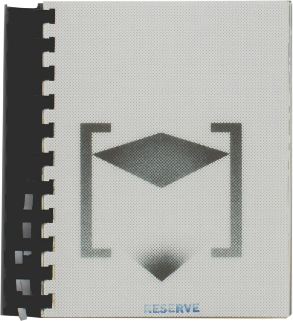
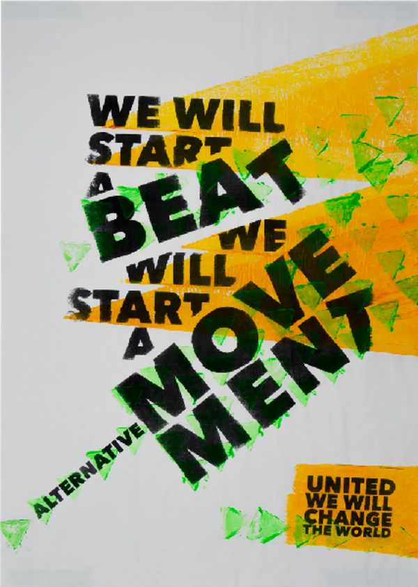
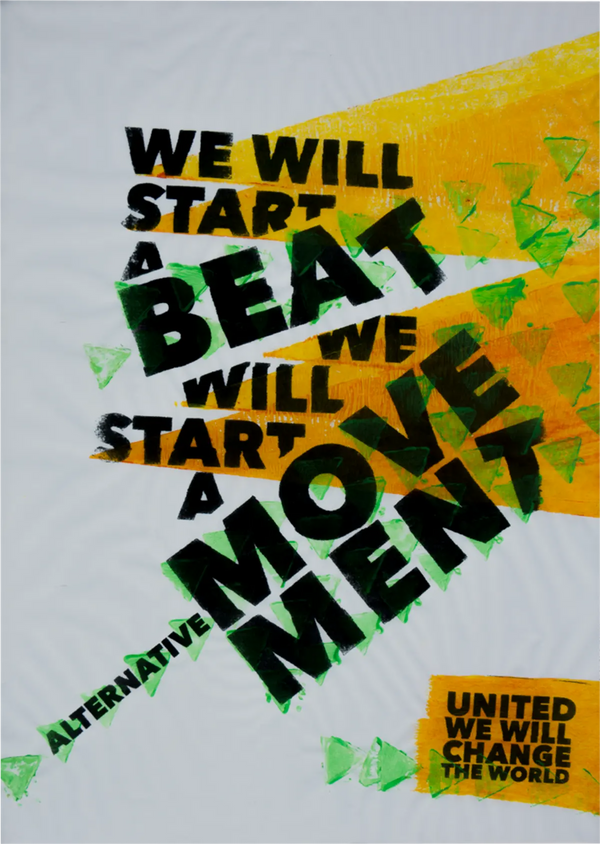
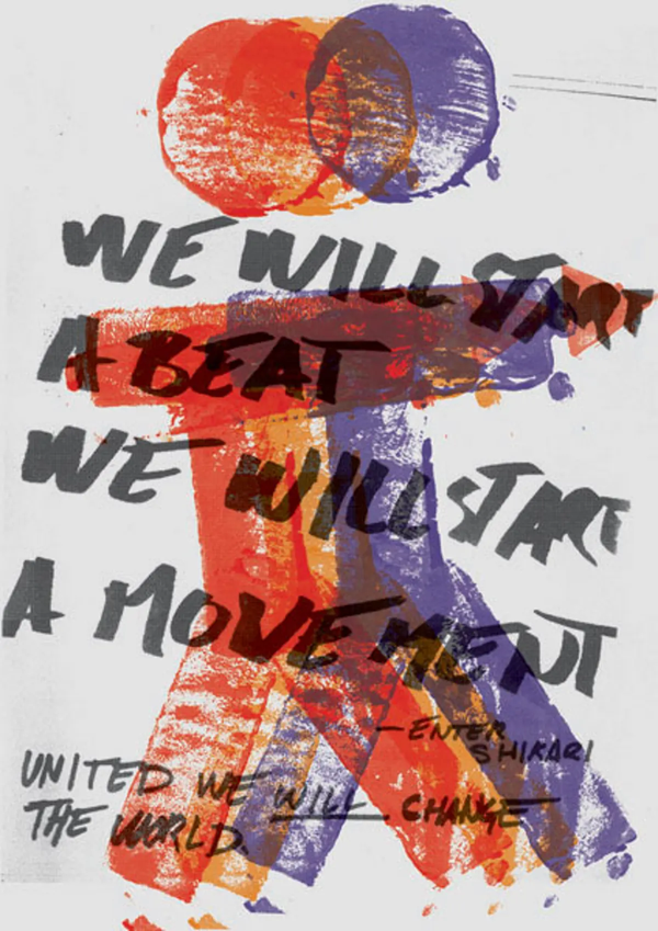
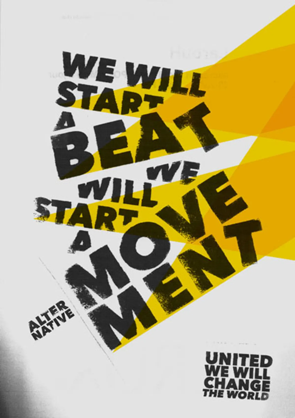
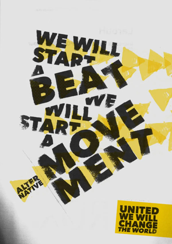
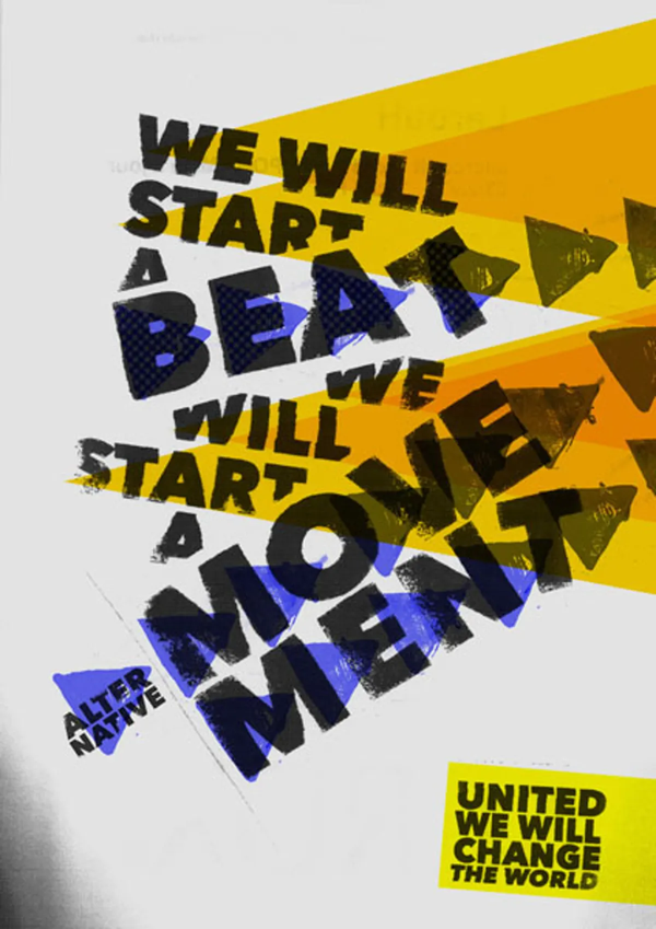
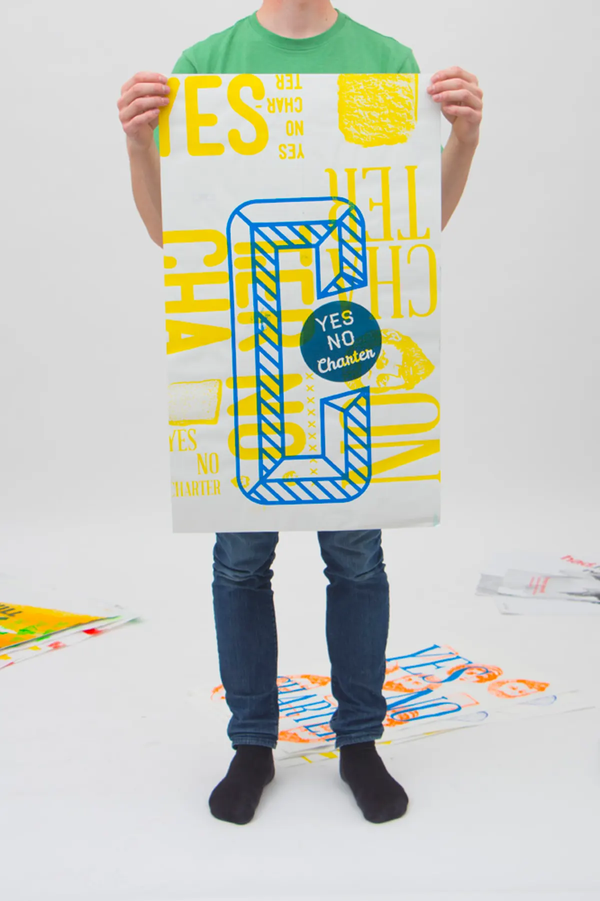
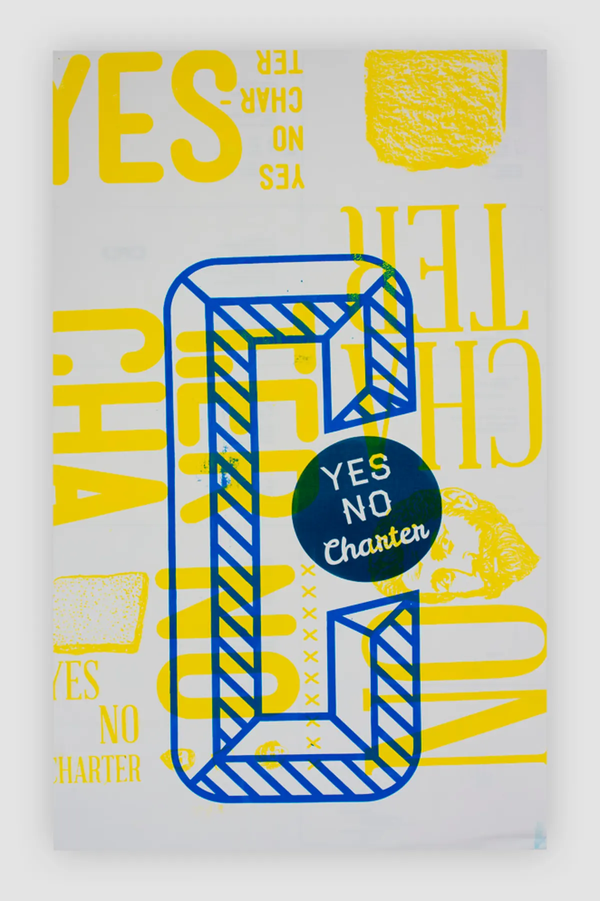
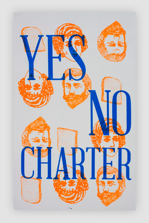
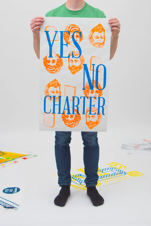
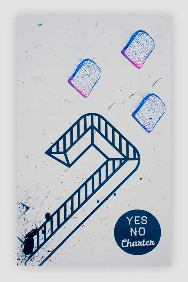
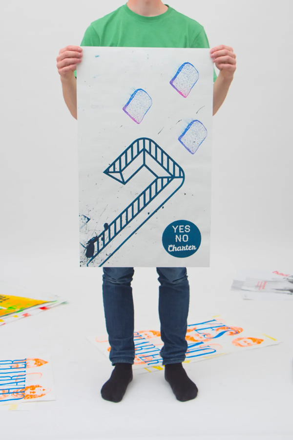
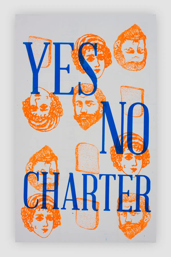
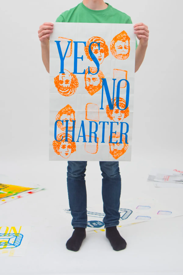
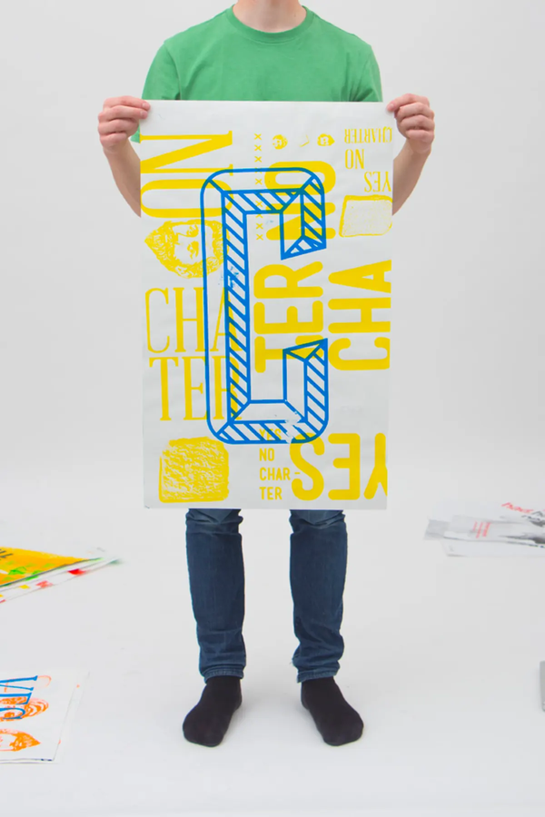
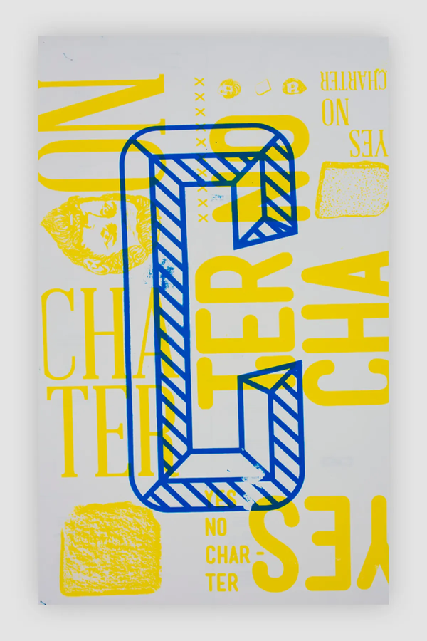
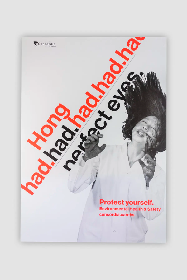
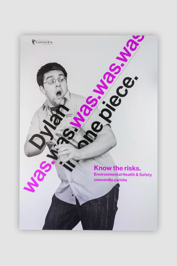
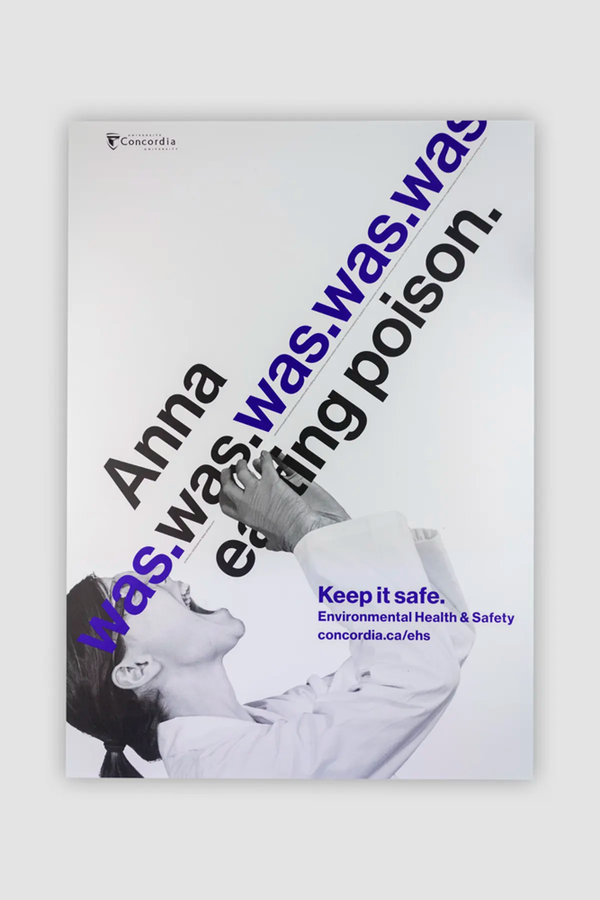
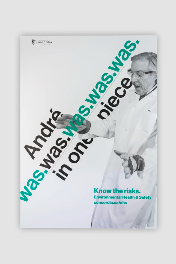
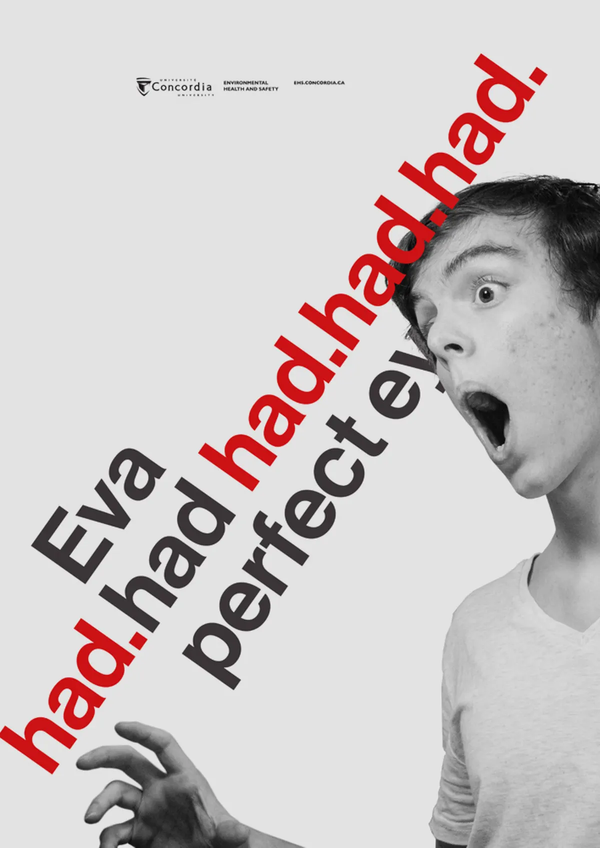
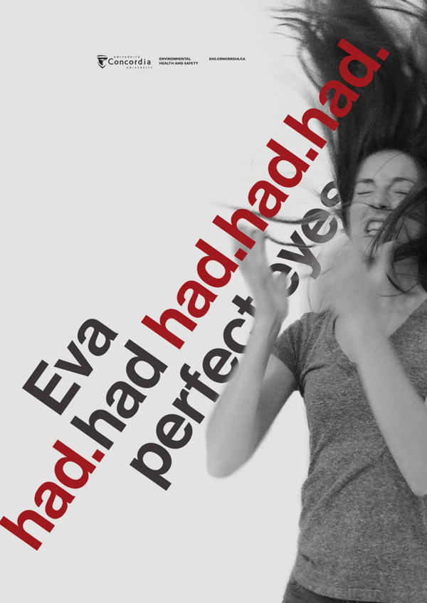
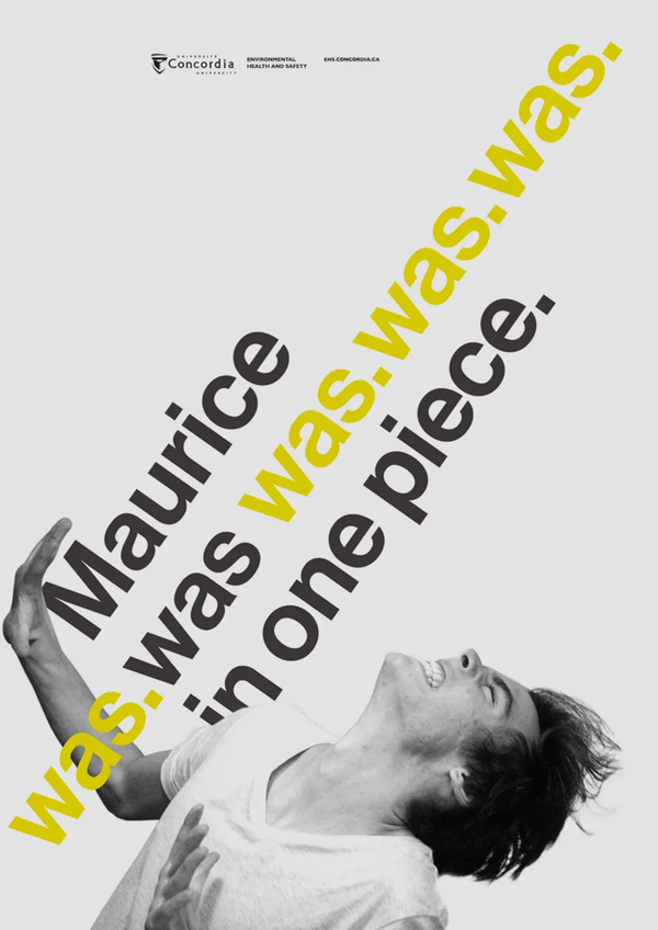
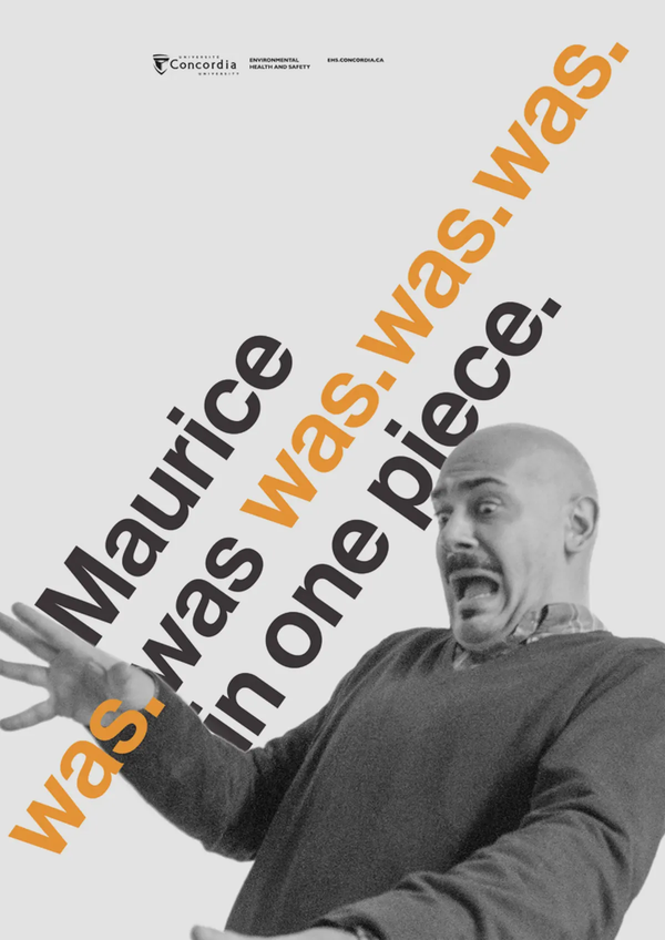
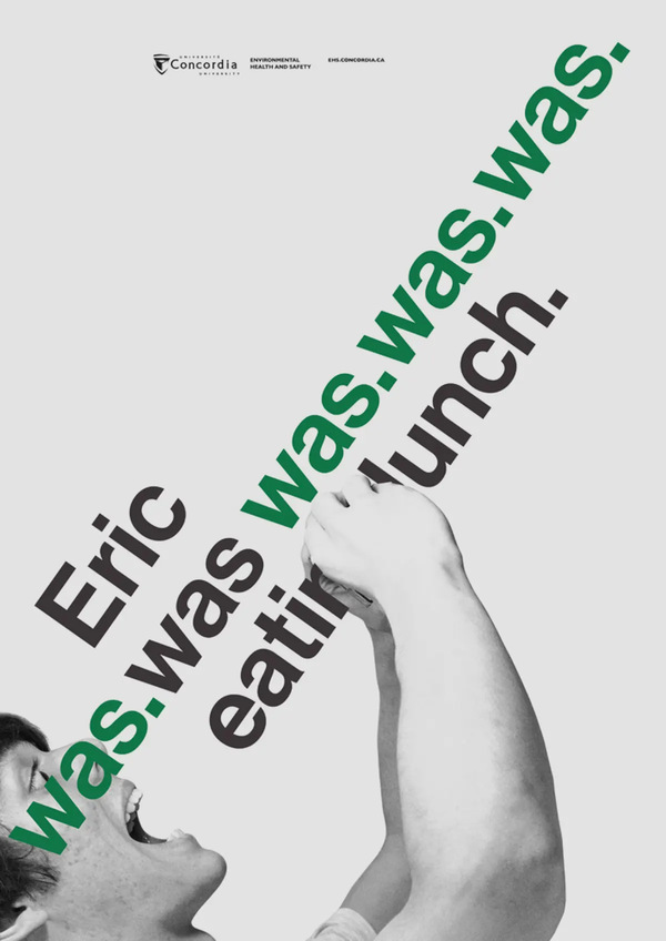
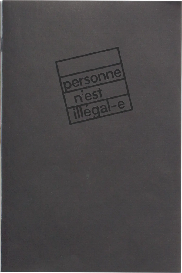
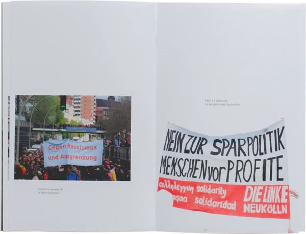
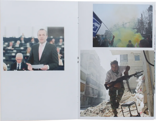
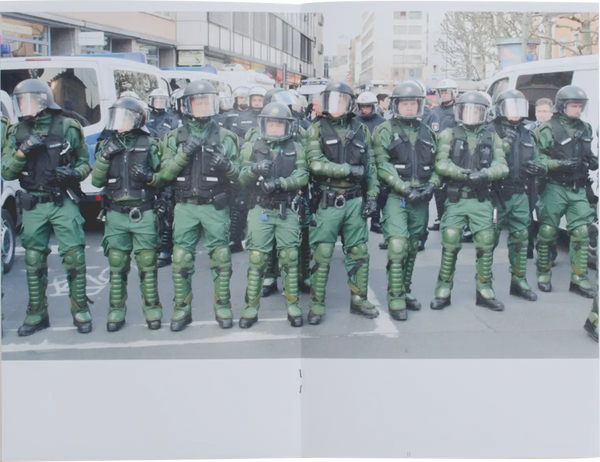
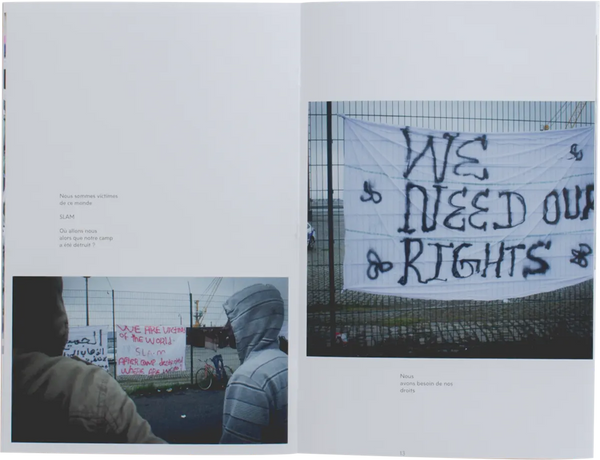
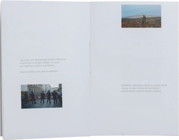
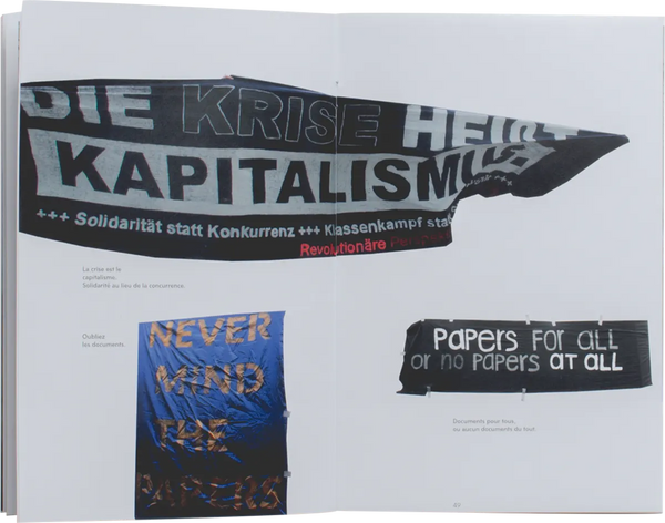
This is a kick off, kind of pedal to the metal, full steam ahead, pronto kind of thing. Newton once wisely said that anything will keep a uniform straight line trajectory as long as nothing applies a force against it, changing the trajectory of both force. Anyway. Directions isn't that, nor it is the opposite. It is rather just a way for me to pause and reflect while connect different past projects together. These six distinct projects all represent different directions, yet define my practice. Starting with [ ] as my thesis project presented at AXENÉO7 in Gatineau. This is somewhat my first print project, yet not the last. We will start a beat, we will start a movement pushed how I could use iteration to produce things very quickly and cheaply. In this project I found a passion for manual graphic exploration, cutting, pasting, photocopying and non-industrial printing methods. Along with Yes No Charter, these posters were also my first political pieces. The Environmental Health and Safety posters is probably my proudest academic achievement to this date. The scale of this project let me see how my work could have a real impact on people. Both VS and Personne n’est illégal-e also demonstrate my willingness to bring political ideas to the viewer in a constructive and open mindset.

Directions is my first exhibition, my first magazine, my starting point as a graphic designer and web developer. Directions is an essay conducted both on the web and on paper (Yes, I printed this too). Directions takes a pause and reflects on projects that shaped my practice, my opinions and my future. Directions is where I want to be, not where I once was.


Design, art direction texts and organisation: Philippe Caron
Supervision: Nathalie Dumont