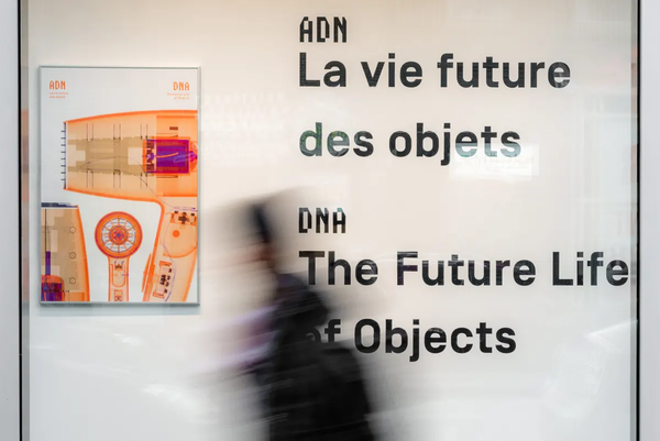
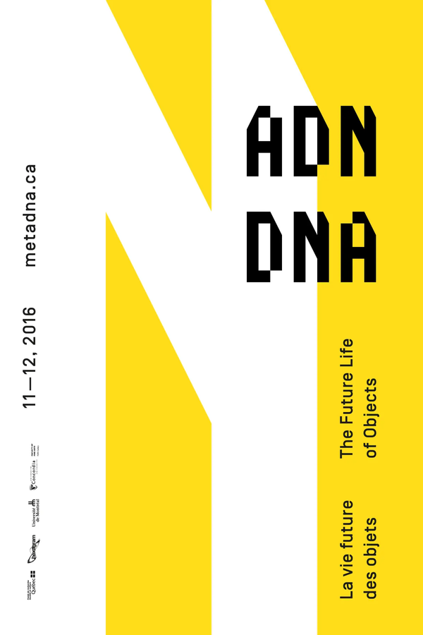
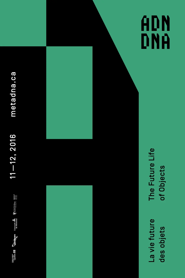
Philippe Caron

Designer & web developer

Directions № 2

April 8, 2017
Philippe Caron

DNA project

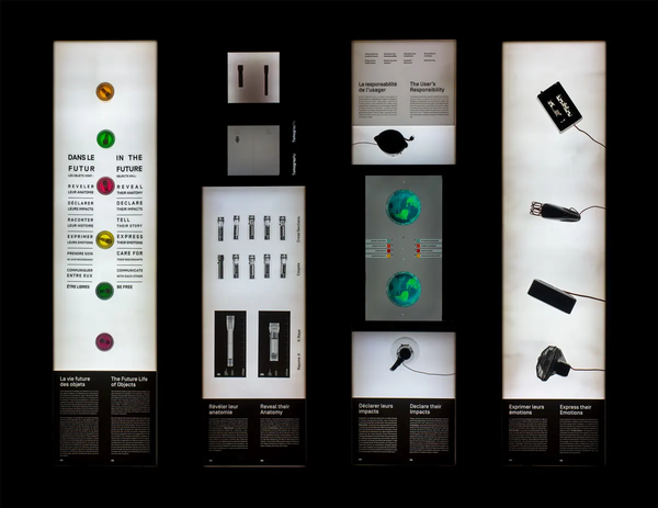
DNA project is a research by creation project. For the duration of the project, we took the time and the means to explore what would the concept of the object become in the future, as they evolve into intelligent objects, as humans start to grasp their environmental impact, and as we start questioning our role as consumers in an object oriented society. This contemplation eventually lead us to write a manifesto, that inspired an interactive exhibition named: DNA, the future life of objects. In this project, my colleague Hugues Rivest and I have worked on 3 distinct interactive experiences for this exhibition.

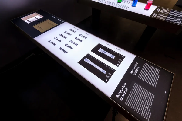
In the future, objects will reveal their anatomy lets you experience the difference of two objects that share the same function, but that are created differently.

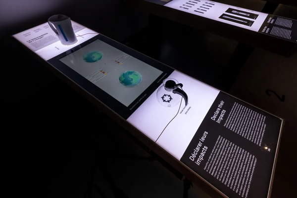
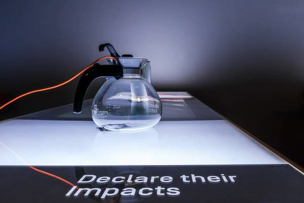
In the future, objects will declare their impacts lets you experience the impact of, again, two objects that share the same function, but have a contrasting environmental impact.

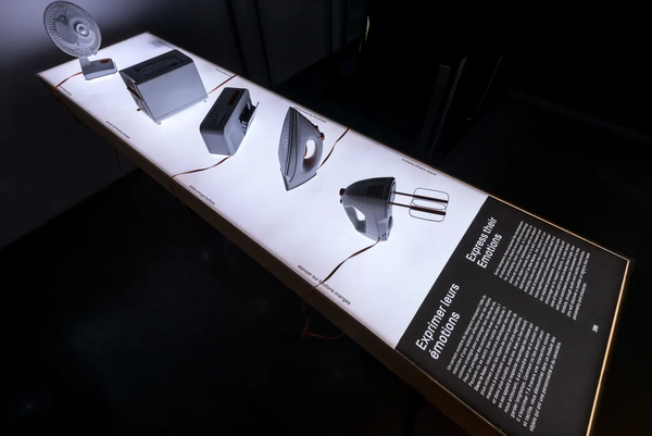
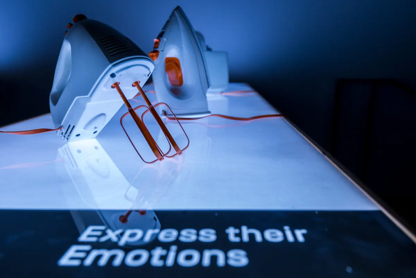
In the future, objects will express their emotions is a playful experiment that gives a personality and a voice to common objects. These objects react in a surprising way to the way we interact with them.

This project was directed by: Martin Racine and Philippe Lalande, with the collaboration of: Alexandre Joyce, Hugues Rivest, Elio Bidinost, Mark Unterberger, Jahon Torbati, Émile Lemay-Racine, Edward Nyamenkum, Samuel Tissot-Jobin, Cecilia Lico and Mario Miranda Luévano.

Four back-lit tables viewed from the top form four rectangles. We can see silhouettes of the objects placed on the tables.
DNA Exhibition. Overview of modules 1, 2, 3 and 5
DNA project

Interactive exhibition. All kinds of materials. Exhibition modules: 8' × 2' × 3' 2"

Poster and name of the exhibition behind a busy vitrine. We can read DNA, the future life of objects in French and English. A blurred figure passes through in the foreground.
DNA exhibition. Vitrine
Three quarter view of an exhibition module. A series of acetates show different slices for a flash light. At one end of the module, a screen is used as an interface for interacting with two physical flash lights.
Exposition ADN. Anatomy module
Three quarter view of an exhibition module. A screen is used as an interface between two physical kettles.
DNA exhibition. Impact module
Close up view of an exhibition module. In the foreground a kettle placed on the module.
DNA exhibition. Impact module
Three quarter view of an exhibition module. A small fan, a toaster, a radio, an iron and a hand mixer are placed on the module.
Exposition ADN. Emotions module
Close up view of an exhibition module. In the ofreground, a hand mixer and iron are placed on the module.
Exposition ADN. Emotions module
Animation showing the modular construction of the logo.
Construction and variations for the Metadna logo
Letters A, D and N compose the DNA logo in French. A label named
Metadna logo
Logo composed of the letters D, N and A. Together, the letters read as DNA.
DNA Logo
Letters A, D and N are composed on a square grid. The grid measures thirteen squares wide by 8 squares high.
Grid for the DNA logo
Graphic layout using the letters D, N and A. The letters are built using modular blocks, and together create proportional negative spaces.
Poster for the Metadna project. Variation 06A
Graphical composition for the letter D in black. The letter D is built using modular blocks, and is used as a graphical grid to place information.
Poster for the Metadna project. Variation 07DR
Graphical composition for the letter N in dark pink. The letter N is built using modular blocks and spans across a gradient from mauve to orange.
Poster for the Metadna project. Variation 08N3
Graphical composition for the letter D in orange. The letter D is built using modular blocks and spans across a gradient from yellow to orange.
Poster for the Metadna project. 08D3
Graphical composition for the letter N in white. The letter N is built using modular blocks and spans across a bright yellow background.
Poster for the Metadna project. Variation 09N2
Graphical composition for the letter A in black. The letter A is built using modular blocks and spans across a green background.
Poster for the Metadna project. Variation 10A

Accra tro tro network

The Accra tro tro network map visualizes data collected by riding the transit system called tro tro in Accra, Ghana. The data collected a large amount of GPS points covering the entire Accra territory. This visualization was created as a proof of concept for ways to use this data. Leading this project was Zachary Patterson, professor and researcher in Geography studies at Concordia University. The data was cleaned and organized by Natalie Wiseman before I started schematizing and drawing the colourful network map. The map is aligned to a hexagonal map inspired by the dataset itself.

Schematized map of the Accra trotro network. Network lines are organized on a hexagonal grid. Six colours represent six areas of the city. Some colours overlap towards the centre of the city.
Accra trotro network
Accra tro tro network

Digital map.
12 x 8,5.

Legend for the Accra trotro network map. Bus hubs are represented by a dot or a pill shape. Line numbers are placed along the route line. On the map, green symbolizes forests and protected areas. Blue represents water, and gray represents landmarks and highways.
Legend for Accra trotro network
Schematized map of the Accra trotro network. Network lines are organized on a hexagonal grid. Six colours represent six areas of the city. Some colours overlap towards the centre of the city.
Accra trotro network

Julien Hébert, fondateur du design moderne au Québec

Julien Hébert, fondateur du design moderne au Québec is a book written by Martin Racine, designer and professor for Concordia University in Montréal. This book shines a light on the life and vision of Julien Hébert using a monumental collection of industrial design pieces, works of art and graphic design. You should read the book. This book was printed in black and orange, as most available photos were in tones of greys. The Pantone color creates a conducting thread throughout the pages, most notably to anchor the book's navigation system. This book was designed in collaboration with Edward Nyamenkum, and the active participation from the author.

Book cover. A monochrome photo of a reclining person in a pool chair. The book title is printed in orange.
Cover. Julien Hébert, fondateur du design moderne au Québec
Julien Hébert, fondateur du design moderne au Québec

Book published by Éditions du Passage
Duotone Offset print on Lynx Opaque Ultra Smooth paper.
Smyth-sewn glued on cover binding.
7 ½" × 10" closed, 15" × 10" open. 256 pages.

Open book, showing a colour photo of Montreal metro station Place Saint-Henri. The photo is positioned in the centre of the spread, across the centre fold.
Julien Hébert, fondateur du design moderne au Québec. Pages 232-233
Open book, showing the first spread of a chapter. On the left page, a sketch drawn in white on an orange background.
Julien Hébert, fondateur du design moderne au Québec. Pages 6-7
Open book, showing a layout designed for long paragraphs, with smaller photos in the right margin.
Julien Hébert, fondateur du design moderne au Québec. Pages 44-45
Open book, showing the first spread of a chapter. On the left page, a monochrome photograph is printed full page.
Julien Hébert, fondateur du design moderne au Québec. Pages 166-167
Open book, showing on one side two monochrome photos on a orange page background.
Julien Hébert, fondateur du design moderne au Québec. Pages 182-183
Open book, showing three monochrome photos of a folding chair.
Julien Hébert, fondateur du design moderne au Québec. Pages 194-195
Open book, showing a colour photo of Montreal metro station Place Saint-Henri. The photo is positioned in the center of the spread, across the center fold.
Julien Hébert, fondateur du design moderne au Québec. Pages 230-231

Directions

A year after heading into a non-specific direction, here is the second edition. Graduated from a BFA in design and computation arts, I can only notice how the thing that I create are fragile. This fragility is only amplified with time. Things degrade and then we forget. When I say time, I am referring to the tools that evolve and become obsolete, broken. When I say degradation, I think of all my paper projects piled up in a cardboard box, but also the ones that I left on a server, somewhere on the Web. When I say that we forget, I think of all the digital files that I methodically organize and store safely, just to never modify them again.

In Issue 2 of Directions, I begin pondering on the future of my digital productions. As I also begin a Master in museum studies, I try to give answers to this specific problem, but I do not have the answers.

If I don't have any answers, I can still show some of my most recent productions. These represent in time my largest achievements as a designer. The Metadna Project certainly led me to museum studies. This research by creation project for which I spent no less than 4 years reflecting, experimenting and creating. The resulting exhibition ended up being presented in different spaces and contexts, and continuing to travel around. The second introduced me to the world of geography and map making. The Accra Trotro network map was a challenging, but important design project that re-emphasized the role of design for geography research. The third, a book, was a phenomenal early accomplishment that I was able to share with a good friend, and allowed me to leave a very little contribution in the world of book design. Together, I find these productions all have a different future, in very different domains: exhibition design, geography and the library.


Design, art direction, writing and coordination : Philippe Caron
Photos for Metadna project: Philippe Lalande et Philippe Caron